Lakrits UI
A React component library exploring how design systems are built
Overview
Lakrits UI is a personal project exploring how design systems are created and maintained from an engineering perspective.
The idea started from two places: curiosity and practicality. Through my work at Opera, I have worked with different design system projects and used a variety of existing component libraries. While these tools are incredibly useful, I wanted to better understand what happens behind the scenes — how components are structured, how decisions are made, and how a system can scale over time.
At the same time, I found myself rebuilding similar components across different projects. Creating my own component library felt like an opportunity to solve a real problem while learning more about the foundations of design systems.
Why I Built It
I wanted a component library that I could use across my own projects — something that would help me move faster while still giving me complete control over the design and implementation.
Existing libraries are great for quickly getting started, but they often come with their own patterns, limitations, and decisions. Building Lakrits UI allows me to create a system that matches how I like to design and develop products.
The goal isn't to replace established libraries, but to understand the process of creating one and build something that works specifically for my own workflow.
Building the Foundation
The first stage of the project has focused on creating the foundation of the system.
This includes:
- Creating the base component architecture
- Establishing reusable patterns
- Exploring component APIs
- Building a consistent visual language
- Creating the first version of the project website
Documentation
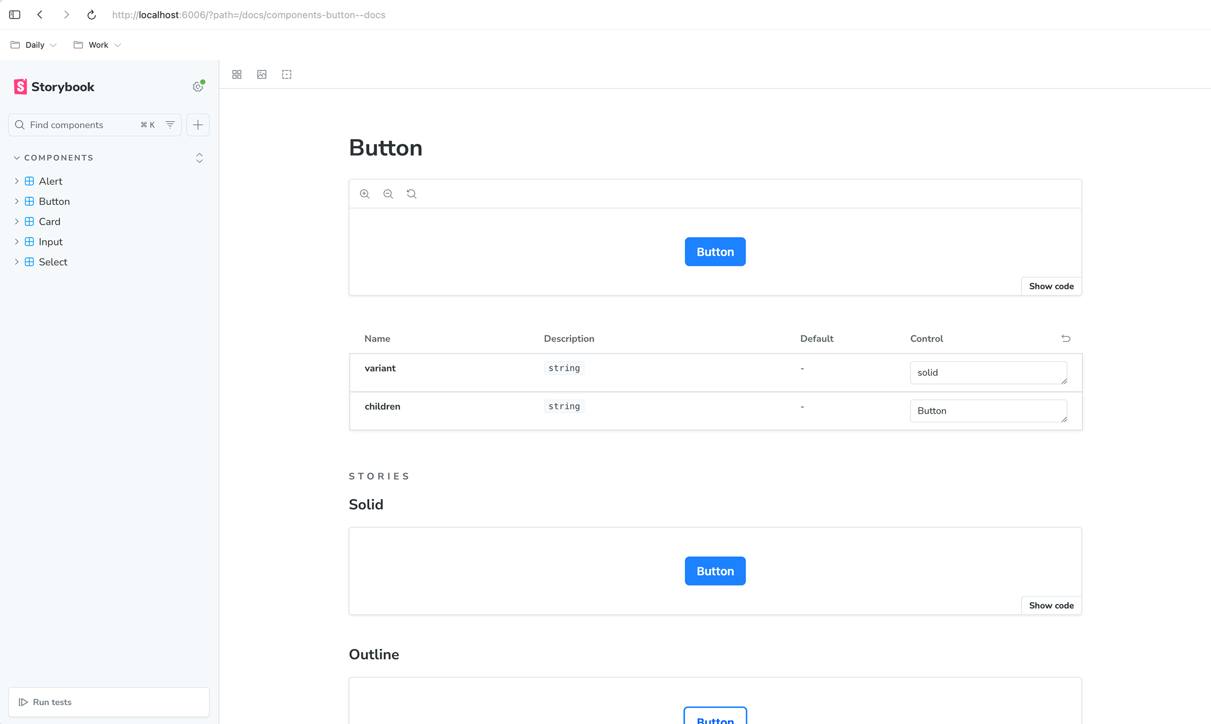
The documentation website is an important part of Lakrits UI and will eventually host documentation for all the components and their use cases.
Rather than treating documentation as something added later, I use the website as part of the development process. It provides a testing ground where I can see how the library works as a whole using npm link and npm unlink in different projects.
Current Progress
Lakrits UI is currently in active development.
Completed:
- Base component library structure
- Initial components
- First version of the documentation website
Currently exploring:
- Expanding the component library
- Improving component patterns
- Refining the developer experience
- Testing the system through real projects
What’s Next
The next stage is continuing to grow Lakrits UI into a more complete system.
Future areas of exploration:
- More complex components
- Improved accessibility
- Better documentation examples
- More robust testing
- Using the library across future personal projects
What I’ve Learned So Far
Building Lakrits UI has been a way to better understand the relationship between design and engineering.
The project started as a way to avoid rebuilding the same components repeatedly, but it has become a deeper exploration into how systems are created, maintained, and improved over time.